In this Matplotlib tutorial we want to learn about Matplotlib Line Plot, so a line plot, as the name suggests, displays data points as markers connected by straight lines. It is particularly useful for visualizing the progression of numerical data across a continuous axis, such as time. Line plots.
Getting Started with Matplotlib Line Plot
First of all we need to install matplotlib and we can use pip for that.
|
1 |
pip install matplotlib |
After the installation, you can import Matplotlib’s pyplot module, which provides a simple interface for creating plots:
|
1 |
import matplotlib.pyplot as plt |
Creating a Basic Line Plot
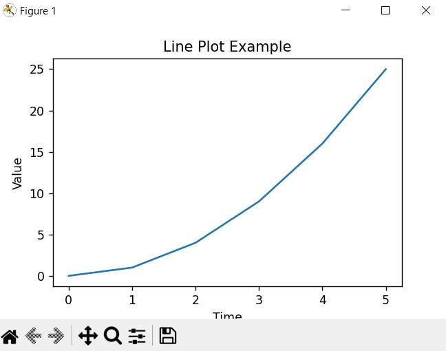
Let’s start by creating a basic line plot using sample data. Suppose we have two lists representing time points and corresponding values:
|
1 2 |
time = [0, 1, 2, 3, 4, 5] values = [0, 1, 4, 9, 16, 25] |
We can plot these values against time using Matplotlib:
|
1 2 3 4 5 |
plt.plot(time, values) plt.xlabel('Time') plt.ylabel('Value') plt.title('Line Plot Example') plt.show() |
This is the complete code
|
1 2 3 4 5 6 7 8 9 |
import matplotlib.pyplot as plt time = [0, 1, 2, 3, 4, 5] values = [0, 1, 4, 9, 16, 25] plt.plot(time, values) plt.xlabel('Time') plt.ylabel('Value') plt.title('Line Plot Example') plt.show() |
In this example, plt.plot() is the primary function responsible for creating the line plot. We provide it with the time and values lists as arguments, which are then plotted on the x and y axes, respectively. The plt.xlabel(), plt.ylabel(), and plt.title() functions add labels and a title to the plot for clarity.
This will be the result
Customizing Line Plots
Matplotlib offers different customization options to tailor line plots according to your preferences. These are some common customizations:
- Line Styles and Colors: You can specify different line styles and colors using the linestyle and color parameters in the plt.plot() function. For example:
|
1 |
plt.plot(time, values, linestyle='--', color='r') |
- Markers: Adding markers at data points can enhance visibility. You can specify marker styles and colors using the marker and markerfacecolor parameters:
|
1 |
plt.plot(time, values, marker='o', markerfacecolor='g') |
- Line Width and Transparency: Adjusting line width (linewidth) and transparency (alpha) can improve readability and aesthetics:
|
1 |
plt.plot(time, values, linewidth=2, alpha=0.7) |
- Grid Lines: Adding grid lines can help in interpreting the plot. You can enable grid lines using the plt.grid() function:
|
1 |
plt.grid(True) |
Learn More on Python Matplotlib
- Learn Python Matplotlib
- Data Visualization in Matplotlib
- How to Create Plotting Styles in Matplotlib
- How to Create Time Series in Matplotlib
- How to Customize Matplotlib Graphs
- How to Create Interactive Plots in Matplotlib
- Matplotlib Histogram
- 3D Plot in Matplotlib
- How to Create Subplots with Matplotlib
- Matplotlib Animation
Subscribe and Get Free Video Courses & Articles in your Email