In this article we want to Learn Python Matplotlib, so Python is one of the most popular programming language, and it offers powerful library called Matplotlib that is used for data scientists and analysts for creating nice visualizations. In this tutorial we want to talk about the fundamentals of Matplotlib and also we will learn about the key features and functionalities of matplotlib.
Why Learn Python Matplotlib ?
Matplotlib is used in Python for data visualization, because it is simple and flexible. also using Matplotlib, you can generate different types of visualizations like line plots, scatter plots, bar charts, histograms and many more. it also provides good control over every part of your visualizations, and it enables you to customize colors, labels, fonts and styles to match your specific requirements. You can use Matplotlib with different operating systems and integrates with popular libraries like NumPy and Pandas, and it is an excellent choice for data analysis.
First of all we need to install Matplotlib and we can use pip for that.
|
1 |
pip install matplotlib |
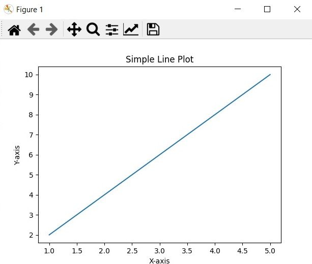
Matplotlib Line Plot
Line plots are ideal for visualizing trends and patterns over continuous or sequential data. Let’s start by creating a simple line plot using Matplotlib:
|
1 2 3 4 5 6 7 8 9 10 11 12 13 14 15 16 |
import matplotlib.pyplot as plt # Data x = [1, 2, 3, 4, 5] y = [2, 4, 6, 8, 10] # Plotting plt.plot(x, y) # Customize the plot plt.title("Simple Line Plot") plt.xlabel("X-axis") plt.ylabel("Y-axis") # Display the plot plt.show() |
Run the complete and this will be the result
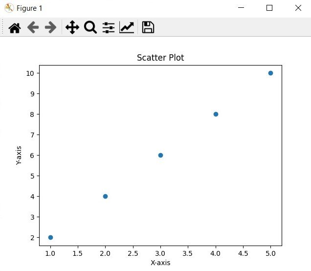
Matplotlib Scatter Plot
Scatter plots are useful for visualizing the relationship between two variables. now let’s create a scatter plot to show the distribution of data points:
|
1 2 3 4 5 6 7 8 9 10 11 12 13 14 15 16 |
import matplotlib.pyplot as plt # Data x = [1, 2, 3, 4, 5] y = [2, 4, 6, 8, 10] # Plotting plt.scatter(x, y) # Customize the plot plt.title("Scatter Plot") plt.xlabel("X-axis") plt.ylabel("Y-axis") # Display the plot plt.show() |
Run your code and this will be the result
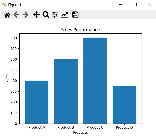
Matplotlib Bar Chart
Bar charts are effective in comparing categorical data or displaying frequency distributions. This is an example of a bar chart that shows the sales performance of different products:
|
1 2 3 4 5 6 7 8 9 10 11 12 13 14 15 16 |
import matplotlib.pyplot as plt # Data products = ["Product A", "Product B", "Product C", "Product D"] sales = [400, 600, 800, 350] # Plotting plt.bar(products, sales) # Customize the plot plt.title("Sales Performance") plt.xlabel("Products") plt.ylabel("Sales") # Display the plot plt.show() |
Run this code and this will be the output
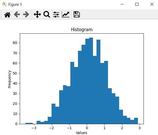
Matplotlib Histogram
Histograms are useful for visualizing the distribution of a dataset. This is an example of creating a histogram to display the frequency of data points:
|
1 2 3 4 5 6 7 8 9 10 11 12 13 14 15 16 |
import matplotlib.pyplot as plt import numpy as np # Generate random data data = np.random.randn(1000) # Plotting plt.hist(data, bins=30) # Customize the plot plt.title("Histogram") plt.xlabel("Values") plt.ylabel("Frequency") # Display the plot plt.show() |
This will be the result
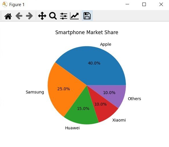
Matplotlib Pie Chart
Pie charts are an excellent way for illustrating proportions or percentages. Let’s create a pie chart to represent the market share of different smartphone brands:
|
1 2 3 4 5 6 7 8 9 10 11 12 13 14 |
import matplotlib.pyplot as plt # Data brands = ['Apple', 'Samsung', 'Huawei', 'Xiaomi', 'Others'] market_share = [40, 25, 15, 10, 10] # Plotting plt.pie(market_share, labels=brands, autopct='%1.1f%%') # Customize the plot plt.title("Smartphone Market Share") # Display the plot plt.show() |
This will be the output
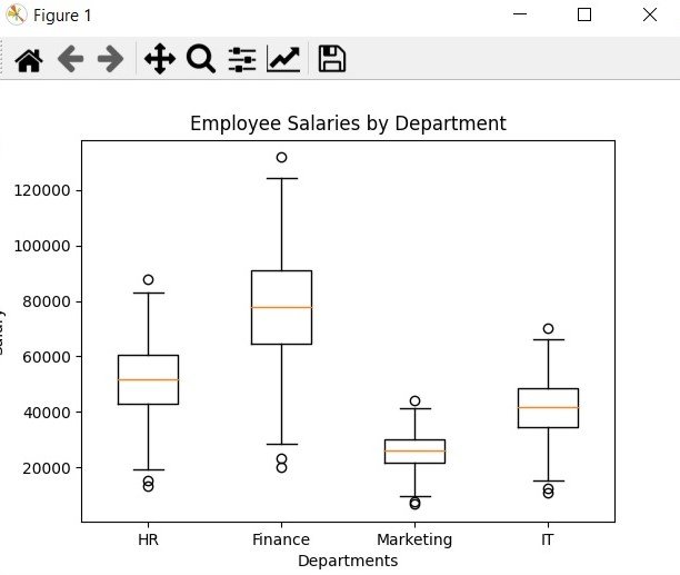
Matplotlib Box Plots
Box plots provides a visual summary of a dataset distribution, including median, quartiles, and outliers. This is an example of creating a box plot to compare the salaries of employees in different departments:
|
1 2 3 4 5 6 7 8 9 10 11 12 13 14 15 16 17 18 |
import matplotlib.pyplot as plt import numpy as np # Generate random data np.random.seed(1) salaries = np.random.normal(50000, 15000, 200) departments = ['HR', 'Finance', 'Marketing', 'IT'] # Plotting plt.boxplot([salaries, salaries*1.5, salaries*0.5, salaries*0.8], labels=departments) # Customize the plot plt.title("Employee Salaries by Department") plt.xlabel("Departments") plt.ylabel("Salary") # Display the plot plt.show() |
This will be the output
Matplotlib Tutorials For Beginners
1: Matplotlib Introduction & Installation
2: Matplotlib Plotting Multiple Curves
3: Matplotlib Plotting Scatter (Points)
4: Matplotlib Plotting BarChart
5: Matplotlib Plotting PieChart
6: Matplotlib Plotting Histogram
7: Matplotlib Plotting BoxPlot
Subscribe and Get Free Video Courses & Articles in your Email
