In this Matplotlib tutorial we want to learn about Data Visualization in Matplotlib, so Data visualization is an important part of data analysis and exploration. because it helps us understand patterns, trends and relationships in the data, for data visualization in Python we have different options, one of them is Matplotlib, so Matplotlib is one of the most popular libraries for creating nice visualizations. In this article we want to talk about Matplotlib and explore its features.
First of all we need to install Matplotlib and we can use pip for that.
|
1 |
pip install matplotlib |
After that it has been installed, now we can import the necessary modules and start creating beautiful visualizations.
Matplotlib Line Plot
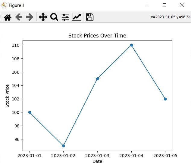
A line plot is one of the simplest and most commonly used visualizations. Let’s consider a scenario where we want to analyze the stock prices of a particular company over time.
|
1 2 3 4 5 6 7 8 9 10 11 12 13 14 15 16 |
import matplotlib.pyplot as plt # Stock prices dates = ['2023-01-01', '2023-01-02', '2023-01-03', '2023-01-04', '2023-01-05'] prices = [100, 95, 105, 110, 102] # Plotting the line chart plt.plot(dates, prices, marker='o') # Adding labels and title plt.xlabel('Date') plt.ylabel('Stock Price') plt.title('Stock Prices Over Time') # Displaying the chart plt.show() |
This code will create a line plot with dates on the x-axis and stock prices on the y-axis. The marker=o argument adds circular markers at each data point. The resulting visualization provides a clear representation of how the stock prices have changed over time.
Run the code and this will be the result
Matplotlib Bar Plot
Bar plots are great for comparing categorical data. Let’s say we have data on the revenue generated by different product categories for a company.
|
1 2 3 4 5 6 7 8 9 10 11 12 13 14 15 16 |
import matplotlib.pyplot as plt # Product categories categories = ['Category A', 'Category B', 'Category C', 'Category D'] revenue = [25000, 35000, 42000, 31000] # Plotting the bar chart plt.bar(categories, revenue) # Adding labels and title plt.xlabel('Product Category') plt.ylabel('Revenue') plt.title('Revenue by Product Category') # Displaying the chart plt.show() |
In the above example, we have created a bar plot with product categories on the x-axis and revenue on the y-axis. it will provide a clear comparison of the revenue generated by each category.
Run the code this will be the result

Matplotlib Scatter Plot
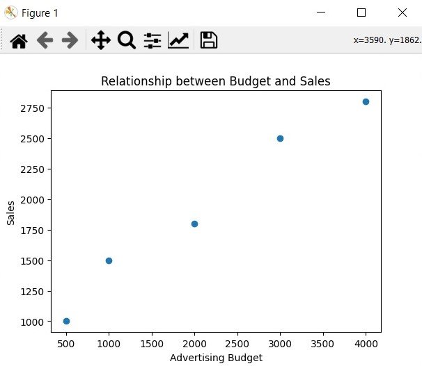
Scatter plots are ideal for visualizing the relationship between two continuous variables. Let’s consider a scenario where we want to analyze the relationship between the advertising budget and the corresponding sales.
|
1 2 3 4 5 6 7 8 9 10 11 12 13 14 15 16 |
import matplotlib.pyplot as plt # Advertising budget and sales data budget = [500, 1000, 2000, 3000, 4000] sales = [1000, 1500, 1800, 2500, 2800] # Plotting the scatter plot plt.scatter(budget, sales) # Adding labels and title plt.xlabel('Advertising Budget') plt.ylabel('Sales') plt.title('Relationship between Budget and Sales') # Displaying the chart plt.show() |
This code generates a scatter plot where the advertising budget is plotted on the x-axis and sales on the y-axis. and this visualization will help us to understand the correlation between the advertising budget and sales.
This will be the result
Learn More on Python Matplotlib
Subscribe and Get Free Video Courses & Articles in your Email
