In this Matplotlib article we want to learn about PieChart in Matplotlib, now at their core, pie charts shows the relationship between parts and the whole. Each slice of the pie corresponds to a category or subset of the data, with its size proportional to the value it represents relative to the total. Pie charts are particularly effective when visualizing categorical data with a few distinct categories, and this makes them ideal for illustrating proportions, distributions, and compositions.
Creating PieChart in Matplotlib
First of all we need to install Matplotlib and we can use pip for that.
|
1 |
pip install matplotlib |
After installation Matplotlib provides a straightforward interface for generating pie charts. Let’s begin with a basic example:
|
1 2 3 4 5 6 7 8 9 10 |
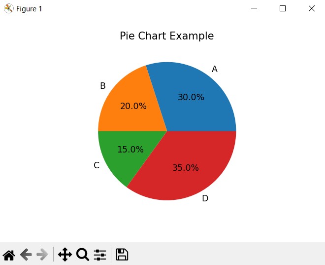
import matplotlib.pyplot as plt # Sample data sizes = [30, 20, 15, 35] labels = ['A', 'B', 'C', 'D'] plt.figure(figsize=(6, 6)) plt.pie(sizes, labels=labels, autopct='%1.1f%%') plt.title('Pie Chart Example') plt.show() |
In this example, we use the plt.pie() function to create the pie chart. We pass the sizes list containing the values for each category and the labels list containing category labels. The autopct parameter formats the percentage display on each slice. Finally, plt.title() adds a title to the chart for clarity.
Run the code and this will be the result
Learn More on Python Matplotlib
- Learn Python Matplotlib
- Data Visualization in Matplotlib
- How to Create Plotting Styles in Matplotlib
- How to Create Time Series in Matplotlib
- How to Customize Matplotlib Graphs
- How to Create Interactive Plots in Matplotlib
- Matplotlib Histogram
- 3D Plot in Matplotlib
- How to Create Subplots with Matplotlib
- Matplotlib Animation
Subscribe and Get Free Video Courses & Articles in your Email