In this Matplotlib article, we want to learn about Matplotlib BarCharts, so Barcharts are graphical representations of categorical data where the length or height of bars corresponds to the magnitude of the data they represent. They are very useful in illustrating comparisons between different categories or showing the distribution of a single categorical variable. Bar charts are particularly effective for visualizing discrete data, and this makes them important tools in data analysis and communication.
First of all we need to install Python Matplotlib and you can use pip for that.
|
1 |
pip install matplotlib |
Creating BarCharts with Matplotlib
Matplotlib simplifies the creation of bar charts through its intuitive interface. Let’s dive into a basic example:
|
1 2 3 4 5 6 7 8 9 10 11 12 |
import matplotlib.pyplot as plt # Sample data categories = ['A', 'B', 'C', 'D'] values = [10, 20, 15, 25] plt.figure(figsize=(8, 6)) plt.bar(categories, values) plt.xlabel('Categories') plt.ylabel('Values') plt.title('Bar Chart Example') plt.show() |
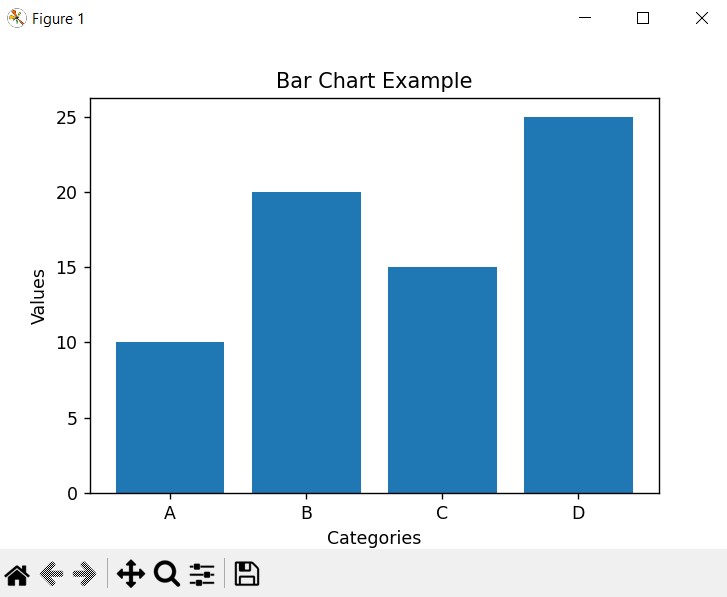
In this example, we use the plt.bar() function to create the bar chart. We pass the categories list containing the category labels and the values list containing the corresponding values. plt.xlabel(), plt.ylabel(), and plt.title() functions add labels and a title to the chart for clarity.
Run the complete code and this will be the result

Customizing BarCharts
Matplotlib offers different customization options, and you can create bar charts according to specific requirements and preferences. These are some common customization techniques:
- Bar Color: You can specify custom colors for the bars using the color parameter:
|
1 |
plt.bar(categories, values, color='skyblue') |
- Bar Width: Adjusting the width of the bars can alter the visual appearance of the chart:
|
1 |
plt.bar(categories, values, width=0.5) |
Edge Color and Line Width: Adding edge colors and adjusting line widths can enhance the clarity of the bars:
|
1 |
plt.bar(categories, values, edgecolor='black', linewidth=1.5) |
Horizontal Bar Chart: If desired, you can create horizontal bar charts by using the plt.barh() function:
|
1 |
plt.barh(categories, values) |
Learn More on Python Matplotlib
- Learn Python Matplotlib
- Data Visualization in Matplotlib
- How to Create Plotting Styles in Matplotlib
- How to Create Time Series in Matplotlib
- How to Customize Matplotlib Graphs
- How to Create Interactive Plots in Matplotlib
- Matplotlib Histogram
- 3D Plot in Matplotlib
- How to Create Subplots with Matplotlib
- Matplotlib Animation
Subscribe and Get Free Video Courses & Articles in your Email