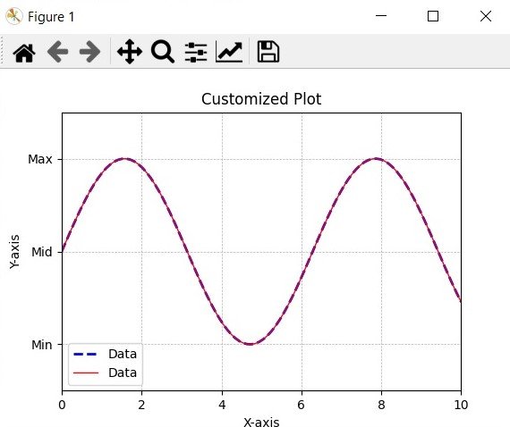
In this Matplotlib article we want to learn How to Customize Matplotlib Graphs, so Python Matplotlib library provides a different array of customization options, and using that you can create visually appealing and informative plots. Customizing plots not only enhances their visual appeal but also enables you to plot data nicely. in this tutorial you will learn about this concept in Matplotlib.
First you should install matplotlib, if you have not installed you can use pip for that like this.
|
1 |
pip install matplotlib |
After installation, we need to import the required classes from matplotlib.
|
1 2 |
import matplotlib.pyplot as plt import numpy as np |
For demonstrating customization, let’s generate some sample data using numpy. We will create arrays x and y to represent the coordinates of the data points.
|
1 2 |
x = np.linspace(0, 10, 100) y = np.sin(x) |
Using Matplotlib plot() function, we can create a basic plot with the generated data, in here, we pass the x and y arrays as inputs and customize the color, linewidth, linestyle and label of the plot line.
|
1 |
plt.plot(x, y, color='blue', linewidth=2, linestyle='--', label='Data') |
Matplotlib provides different customization options. let’s talk about a few of them, These are just a few examples of the many customization options available. You can adjust colors, line styles, font styles, tick marks, legends, plot limits and many more based on your specific requirements.
|
1 2 3 4 5 6 7 8 9 10 11 12 13 14 15 16 17 18 19 20 21 |
# Add Labels and Title plt.xlabel('X-axis') plt.ylabel('Y-axis') plt.title('Customized Plot') # Change Line Style and Color plt.plot(x, y, color='red', linewidth=1, linestyle='-', label='Data') # Customize Ticks and Tick Labels plt.xticks(np.arange(0, 11, 2)) plt.yticks([-1, 0, 1], ['Min', 'Mid', 'Max']) # Add Gridlines plt.grid(True, linestyle='--', linewidth=0.5) # Add Legend plt.legend() # Adjust Plot Limits plt.xlim(0, 10) plt.ylim(-1.5, 1.5) |
For displaying the customized plot, we can use the plt.show() function.
|
1 |
plt.show() |
If you want to save the plot as an image, you can use the plt.savefig() function instead.
|
1 |
plt.savefig('customized_plot.png') |
This is the complete code for this article
|
1 2 3 4 5 6 7 8 9 10 11 12 13 14 15 16 17 18 19 20 21 22 23 24 25 26 27 28 29 30 31 32 33 34 35 36 37 |
import matplotlib.pyplot as plt import numpy as np # Generate Sample Data x = np.linspace(0, 10, 100) y = np.sin(x) # Create the Plot plt.plot(x, y, color='blue', linewidth=2, linestyle='--', label='Data') # Customize the Plot plt.xlabel('X-axis') plt.ylabel('Y-axis') plt.title('Customized Plot') # Change Line Style and Color plt.plot(x, y, color='red', linewidth=1, linestyle='-', label='Data') # Customize Ticks and Tick Labels plt.xticks(np.arange(0, 11, 2)) plt.yticks([-1, 0, 1], ['Min', 'Mid', 'Max']) # Add Gridlines plt.grid(True, linestyle='--', linewidth=0.5) # Add Legend plt.legend() # Adjust Plot Limits plt.xlim(0, 10) plt.ylim(-1.5, 1.5) # Display the Customized Plot plt.show() # Save the Customized Plot as an Image # plt.savefig('customized_plot.png') |
Run the complete code and this will be the result

Learn More on Python Matplotlib
- Learn Python Matplotlib
- Data Visualization in Matplotlib
- How to Create Plotting Styles in Matplotlib
- How to Create Time Series in Matplotlib
Subscribe and Get Free Video Courses & Articles in your Email