In this article we want to talk about Matplotlib in Python, so Data visualization is one of the important part of data analysis. Matplotlib is popular data visualization library in Python, it have different tools and capabilities to create easy and informative visualizations. In this tutorial we want to talk about the basics of using Matplotlib.
What is Matplotlib in Python ?
Matplotlib is note of the best data visualization library, and it provides different plotting functions and tools. also Matplotlib allows you to create line plots, scatter plots, bar plots, histograms, pie charts and many other types of visualizations.
Installing Matplotlib
For working with Matplotlib, first of all we need to install this library and we can use pip for that.
|
1 |
pip install matplotlib |
Matplotlib Line Plot Example
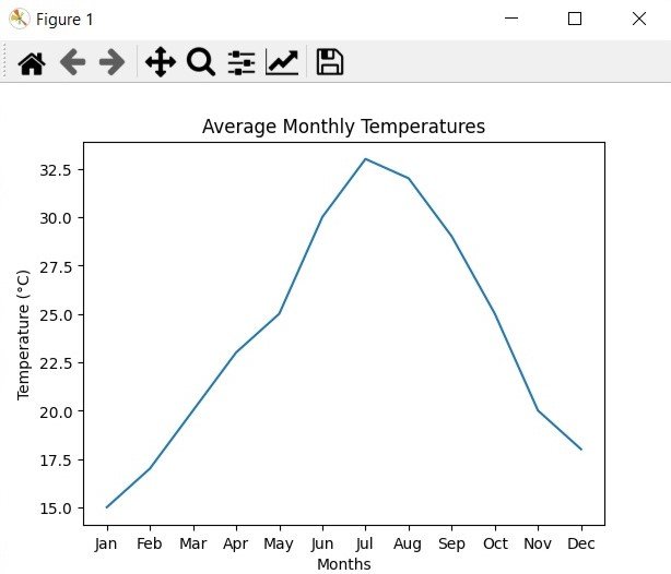
Suppose we have a dataset and it contains the average monthly temperatures in a city over a year. We want to visualize the trend of temperature changes using a line plot. This is how we can do this using Matplotlib:
|
1 2 3 4 5 6 7 8 9 10 11 12 13 14 15 16 |
import matplotlib.pyplot as plt # Sample data months = ['Jan', 'Feb', 'Mar', 'Apr', 'May', 'Jun', 'Jul', 'Aug', 'Sep', 'Oct', 'Nov', 'Dec'] temperatures = [15, 17, 20, 23, 25, 30, 33, 32, 29, 25, 20, 18] # Create a line plot plt.plot(months, temperatures) # Customize the plot plt.title('Average Monthly Temperatures') plt.xlabel('Months') plt.ylabel('Temperature (°C)') # Display the plot plt.show() |
In the above example, we have first defined the dataset, with the months as labels and the corresponding average temperatures. after that we use the plot() function to create a line plot with the months on the x-axis and the temperatures on the y-axis. After customizing the plot with a title, x-axis label, and y-axis label, we use show() to display the plot.
Run the complete code and this will be the result

Other Types of Plots
Matplotlib offers different plot types and options. These are a few examples:
Matplotlib Scatter Plot
|
1 2 3 4 5 6 7 8 9 |
import matplotlib.pyplot as plt x = [1, 2, 3, 4, 5] y = [2, 4, 6, 8, 10] plt.scatter(x, y) plt.title('Scatter Plot') plt.xlabel('X') plt.ylabel('Y') plt.show() |
Matplotlib Bar Plot
|
1 2 3 4 5 6 7 8 9 |
import matplotlib.pyplot as plt categories = ['A', 'B', 'C', 'D'] values = [10, 30, 20, 25] plt.bar(categories, values) plt.title('Bar Plot') plt.xlabel('Categories') plt.ylabel('Values') plt.show() |
Matplotlib Histogram
|
1 2 3 4 5 6 7 8 |
import matplotlib.pyplot as plt data = [1, 2, 3, 3, 4, 5, 5, 5, 6, 6, 7, 8, 8, 9] plt.hist(data, bins=5) plt.title('Histogram') plt.xlabel('Values') plt.ylabel('Frequency') plt.show() |
These examples are simple examples of what Matplotlib can do. You can check the library documentation and examples to learn more about its capabilities.
Learn More on Python Matplotlib
- Learn Python Matplotlib
- Data Visualization in Matplotlib
- How to Create Plotting Styles in Matplotlib
Subscribe and Get Free Video Courses & Articles in your Email