This is our fourth article in Python Matplotlib, in this article we are going to learn about Matplotlib Plotting Barchart. a bar chart or bar graph is a chart or graph that presents categorical data with rectangular bars with heights or lengths proportional to the values that they represent. The bars can be plotted vertically or horizontally. A vertical bar chart is sometimes called a column chart. you can read the previous articles for Python Matplotlib in the below links.
Matplotlib Tutorials For Beginners
1: Matplotlib Introduction & Installation
2: Matplotlib Plotting Multiple Curves
3: Matplotlib Plotting Scatter (Points)
So now let’s create our first Barchart in Matplotlib.
|
1 2 3 4 5 6 7 |
import matplotlib.pyplot as plt data = [5, 10, 20, 30] plt.bar(range(len(data)), data) plt.show() |
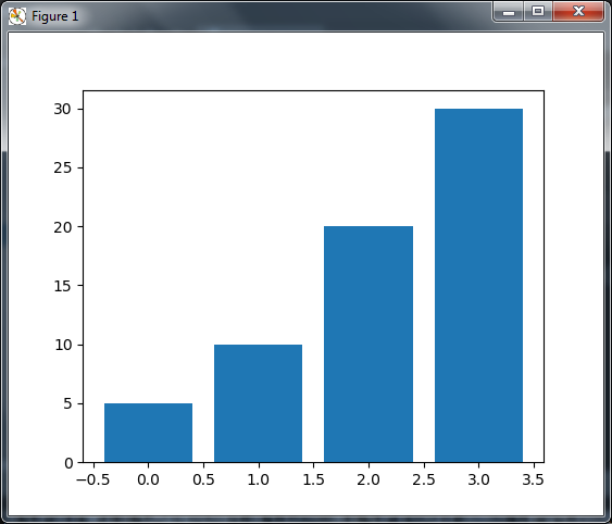
OK in the above code first of of all we have imported our matplotlib library, after that for each value in the list data, one vertical bar is shown. The pyplot.bar() function receives two arguments—the x coordinate for each bar and the height of each bar. Here, we use the coordinates 0, 1, 2, and so on, for each bar, which is the purpose of range(len(data)).
If you run the code this will be the result
Controlling Thickness of the Bar
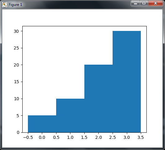
So by default a bar have thickness of 0.8 units. because we put a bar at each unit length,
we have a gap of 0.2 between them. You can, of course, fiddle with this thickness parameter.
for instance, by setting it to 1.
|
1 2 3 4 5 6 7 |
import matplotlib.pyplot as plt data = [5, 10, 20, 30] plt.bar(range(len(data)), data, width = 1) plt.show() |
OK now in the code, the bars have no gap between them.
Horizontal Bars
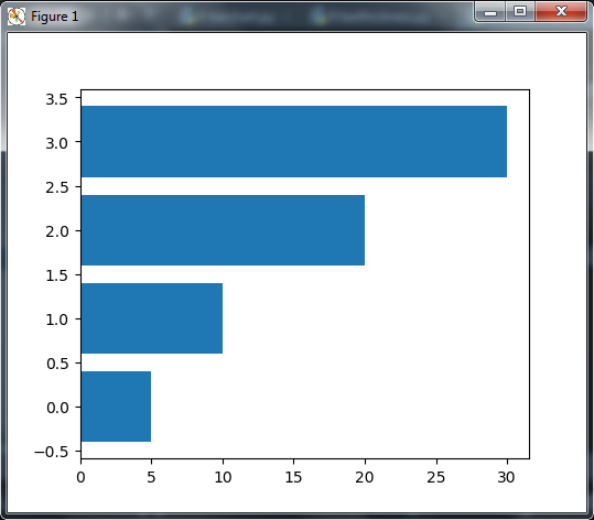
Also you can plot horizontal bars using the barh() function, which is the strict equivalent of bar(), apart from giving horizontal rather than vertical bars.
|
1 2 3 4 5 6 7 |
import matplotlib.pyplot as plt data = [5, 10, 20, 30] plt.barh(range(len(data)), data) plt.show() |
So now if you run the code, you can see that we have horizontal bar instead of vertical bar.
Plotting Multiple BarCharts
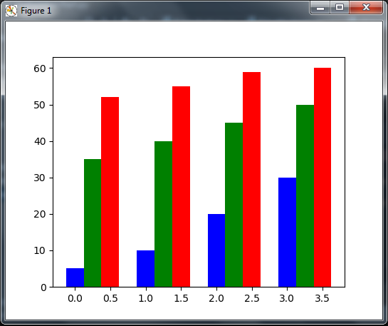
Also you can plot multiple BarCharts in Matplotlib. we can plot multiple bar charts by playing with the thickness and the positions of the bars .
|
1 2 3 4 5 6 7 8 9 10 11 12 13 14 |
import matplotlib.pyplot as plt import numpy as np data = [[5, 10, 20, 30], [35,40,45,50], [52,55,59,60]] X = np.arange(4) plt.bar(X + 0.00, data[0], color = 'b', width = 0.25) plt.bar(X + 0.25, data[1], color = 'g', width = 0.25) plt.bar(X + 0.50, data[2], color = 'r', width = 0.25) plt.show() |
If you run the code this will be the result
Stacked BarCharts
Stacked bar charts are of course possible by using a special parameter from the pyplot. bar() function.
|
1 2 3 4 5 6 7 8 9 10 11 12 13 14 |
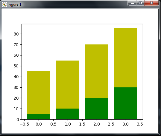
import matplotlib.pyplot as plt A = [5, 10, 20, 30] B = [40,45,50,55] X = range(4) plt.bar(X, A, color = 'g') plt.bar(X, B, color = 'y', bottom = A) plt.show() |
OK in the above code we have imported our matplotlib library , also The optional bottom parameter of the pyplot.bar() function allows you to specify a starting value for a bar. the first call to pyplot.bar() plots the green bars. the second call to pyplot.bar() plots the yellow bars.
If you run the code this will be the result
Subscribe and Get Free Video Courses & Articles in your Email