In this article we want to learn How to Create Plotting Styles in Matplotlib, so Matplotlib is one of the popular Python library for data visualization, and it provides different plotting styles to enhance the readability of your plots. In this article we want to talk about the different plotting styles available in Matplotlib.
Python Matplotlib Plotting Styles
Matplotlib have different plotting styles, and we can call them as stylesheets. These stylesheets defines different aspects of a plot, such as colors, line styles, fonts and gridlines. when you change the style, then you can easily modify the appearance of your plots to match your preferences or the specific requirements of your project.
As we have already mentioned that Matplotlib provides different stylesheets that you can use right away. These stylesheets includes classic, seaborn, ggplot, FiveThirtyEight, and many more. now let’s see a practical example.
Matplotlib Default Style
The default style is applied automatically when you import Matplotlib. but if you want to explicitly set it, you can use the following code:
|
1 2 3 |
import matplotlib.pyplot as plt plt.style.use('default') |
Matplotlib Seaborn Style
Seaborn is popular data visualization library that provides visually appealing and modern plots. To apply the seaborn style in Matplotlib, use the following code:
|
1 |
plt.style.use('seaborn') |
Matplotlib ggplot Style
The ggplot style mimics the ggplot2 library in R. If you prefer this style, use the following code:
|
1 |
plt.style.use('ggplot') |
Matplotlib fivethirtyeight Style
The fivethirtyeight style replicates the visual style of the plots seen on the FiveThirtyEight website. for using this style, use this code.
|
1 |
plt.style.use('fivethirtyeight') |
Customizing Matplotlib Styles
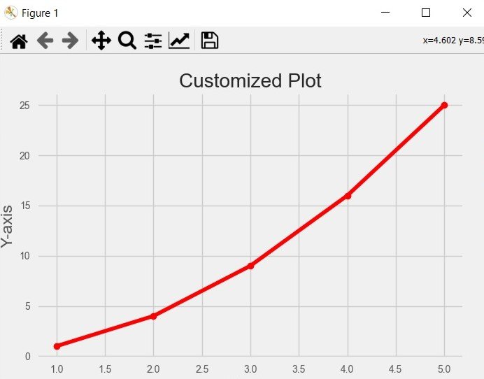
In addition to the built-in stylesheets, Matplotlib also allows you to customize the plot elements manually. You can modify colors, line styles, fonts, gridlines and many more. This is an example of customizing the style of a plot:
|
1 2 3 4 5 6 7 8 9 10 11 12 13 14 15 16 17 18 |
import matplotlib.pyplot as plt plt.plot([1, 2, 3, 4, 5], [1, 4, 9, 16, 25], 'ro-') plt.title('Customized Plot') plt.xlabel('X-axis') plt.ylabel('Y-axis') plt.grid(True) # Customizing the style plt.rcParams['lines.linewidth'] = 2 plt.rcParams['lines.marker'] = 'o' plt.rcParams['axes.facecolor'] = 'lightgray' plt.rcParams['axes.edgecolor'] = 'black' plt.rcParams['axes.linewidth'] = 1.5 plt.show() |
In the above example, we have created a basic line plot and after that customized the plot elements using plt.rcParams. also we modify the line width, marker style, face color, edge color and axes width to create a unique style.
How to Create Plotting Styles in Matplotlib
So now let’s start creating our code
This is the complete code for this article
|
1 2 3 4 5 6 7 8 9 10 11 12 13 14 15 16 17 18 19 20 21 22 23 24 25 26 27 28 29 30 31 |
import matplotlib.pyplot as plt # Default Style plt.style.use('default') # Seaborn Style plt.style.use('seaborn') # ggplot Style plt.style.use('ggplot') # fivethirtyeight Style plt.style.use('fivethirtyeight') # Customized Style plt.plot([1, 2, 3, 4, 5], [1, 4, 9, 16, 25], 'ro-') plt.title('Customized Plot') plt.xlabel('X-axis') plt.ylabel('Y-axis') plt.grid(True) # Customizing the style plt.rcParams['lines.linewidth'] = 2 plt.rcParams['lines.marker'] = 'o' plt.rcParams['axes.facecolor'] = 'lightgray' plt.rcParams['axes.edgecolor'] = 'black' plt.rcParams['axes.linewidth'] = 1.5 plt.show() |
Run the code and this will be the result

Learn More on Python Matplotlib
Subscribe and Get Free Video Courses & Articles in your Email