In this article we want to learn How to Create PieChart in Excel with Python, For creating a PieChart in Excel using Python, we are going to use XlsxWriter library, it is is a third-party library for working with Microsoft Excel files in Python. XlsxWriter is capable of handling different functionalities such as writing text, numbers, formulas and hyperlinks to multiple worksheets, also it supports features like formatting. It’s compatible with Python versions 2.7, 3.4+.
xlsxwriter Installation
You can use pip for xlsxwriter installation like this.
|
1 |
pip install xlsxwriter |
This is the complete code for this article
|
1 2 3 4 5 6 7 8 9 10 11 12 13 14 15 16 17 18 19 20 21 22 23 24 25 26 27 28 29 30 31 32 33 34 35 36 37 38 39 40 41 42 43 44 45 46 47 48 49 50 51 52 53 54 55 56 57 58 59 60 61 62 63 64 |
# import xlsxwriter module import xlsxwriter # Workbook() takes one, non-optional, argument # which is the filename that we want to create. workbook = xlsxwriter.Workbook("pie_chart.xlsx") # The workbook object is then used to add new # worksheet via the add_worksheet() method. worksheet = workbook.add_worksheet() # here we create bold format object . bold = workbook.add_format({'bold':1}) # this is our data with data list headings = ['Category', 'Values'] data = [ ['PyQt6', 'PyQt5++', 'TKinter'], [70, 20, 10], ] # Write a row of data starting from 'A1' # with bold format. worksheet.write_row('A1', headings, bold) # Write a column of data starting from # A2, B2, C2 respectively. worksheet.write_column('A2', data[0]) worksheet.write_column('B2', data[1]) #this is the type of chart chart1 = workbook.add_chart({'type': 'pie'}) # Add a data series to a chart chart1.add_series({ 'name':'Popularity Chart', 'categories':['Sheet1', 1,0,3,0], 'values':['Sheet1', 1,1,3,1], }) #set the title for the chart chart1.set_title({'name':'GUI Library Chart'}) #set the style for the chart chart1.set_style(10) #insert chart to the worksheet worksheet.insert_chart('C2', chart1, {'x_offset':25, 'y_offset':10}) #close the workbook workbook.close() |
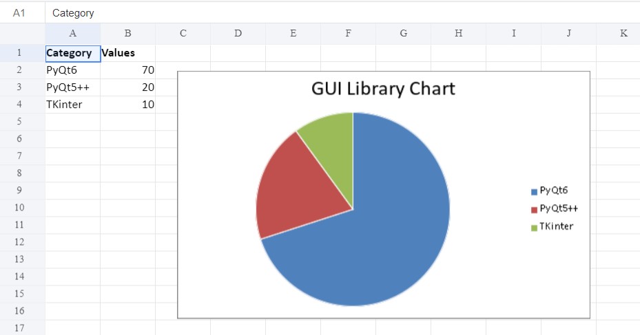
This Python code uses xlsxwriter library to generate a pie chart inside an Excel workbook. It begins by creating a new workbook named “pie_chart.xlsx” and adds a worksheet to it, and it will add different data, including categories and their corresponding values. After that a pie chart is created and added to the worksheet, and it will have the data. The chart’s title is set to ‘GUI Library Chart’, and its style is adjusted. Finally, the workbook is closed. So we can say that above code produces a visual representation of GUI library using a pie chart in an Excel file.
Run the complete code and after that check your working directory for the excel file, open the file and this is the result.
Learn More on PyQt6 Widgets:
- How to Create Label in PyQt6
- How to Create Button in PyQt6
- How to Create LineEdit in PyQt6
- How to Create QHBoxLayout in PyQt6
FAQS:
Can you make pie charts in Python?
Yes, you can create pie charts in Python using different libraries such as Matplotlib, Plotly, and Seaborn. These libraries provide functions and methods to easily generate pie charts from data.
How do you create a pie chart in Excel step by step?
For creating a pie chart in Excel:
-
- Select the data range you want to include in the chart.
- Go to the “Insert” tab on the Excel ribbon.
- Click on the “Pie Chart” option and choose the desired pie chart type.
- Excel will generate a default pie chart based on your selected data. You can further customize the chart by adding titles, labels, and adjusting formatting options.
How do I create a graph for Excel data using Python pandas?
You can create a graph for Excel data using Python pandas and Matplotlib. Here’s a step-by-step process:
- Read the Excel data into a pandas DataFrame using the pd.read_excel() function.
- Use Matplotlib to plot the data from the DataFrame. You can create different types of graphs such as line plots, bar plots, scatter plots, etc., depending on your data and visualization needs.
How do I convert an Excel spreadsheet to a pie chart?
For converting an Excel spreadsheet to a pie chart:
-
- Select the data range in Excel that you want to represent in the pie chart.
- Follow the steps mentioned earlier to create a pie chart in Excel.
- Excel will automatically generate a pie chart based on the selected data range, converting the spreadsheet data into a visual representation. You can further customize the chart as needed.
Subscribe and Get Free Video Courses & Articles in your Email
