In this Plotly article we want are going to learn about Python Plotly for Scientific Visualization, first of all let’s talk about data visualization, so data visualization is an important part of scientific research and analysis, because it enables researchers to explore complex data sets, identify patterns and communicate findings effectively. and also Python is one of the best programming languages for this data visualization tasks, because it has a lot of libraries for this purpose, one of the library is Plotly, now first let’s talk about Plotly.
What is Plotly ?
Plotly is an open source Python library that facilitates the creation of interactive and publication quality visualizations. It offers different chart types, including line plots, scatter plots, bar charts, histograms, 3D plots and many more. Plotly visualizations can be embedded in web applications, notebooks, or standalone HTML files.
First of all we need to install this library and we can use pip for that.
|
1 |
pip install plotly |
After that we need to import our required modules from Plotly.
|
1 2 |
import plotly.graph_objects as go import numpy as np |
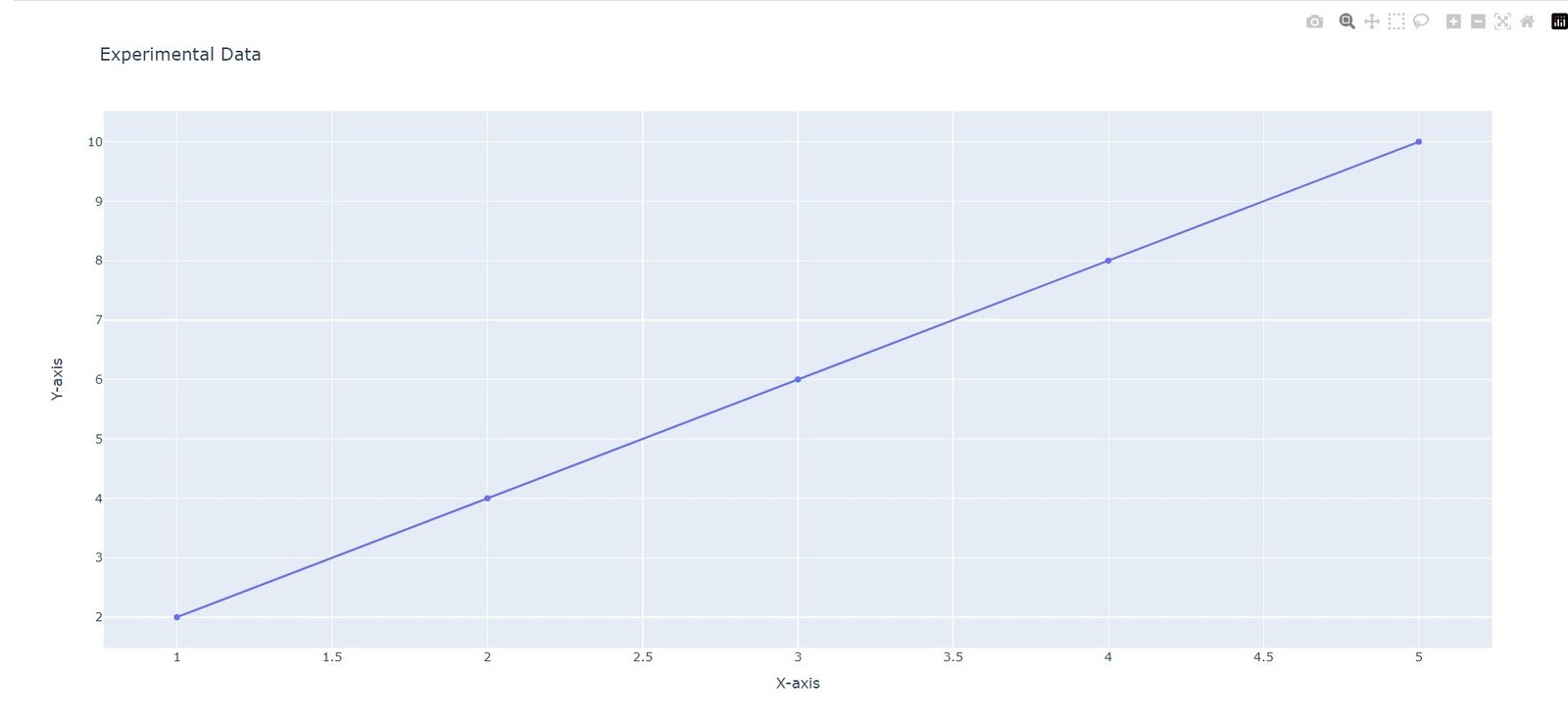
Suppose you have collected data from an experiment and want to visualize the relationship between two variables. Plotly makes it simple to create a line plot.
|
1 2 3 4 5 6 7 8 9 10 |
import plotly.graph_objects as go # Sample data x = [1, 2, 3, 4, 5] y = [2, 4, 6, 8, 10] # Create a line plot fig = go.Figure(data=go.Scatter(x=x, y=y)) fig.update_layout(title='Experimental Data', xaxis_title='X-axis', yaxis_title='Y-axis') fig.show() |
In many scientific scenarios, it is useful to represent data points with a color gradient, indicating a third variable. Let’s consider a situation where we have measurements of temperature at different locations. The following code snippet demonstrates how to create a scatter plot with color gradient using Plotly:
|
1 2 3 4 5 6 7 8 9 10 11 12 13 14 15 16 17 18 19 20 21 22 23 |
import plotly.graph_objects as go import numpy as np # Sample data x = np.random.rand(100) y = np.random.rand(100) temperature = np.random.randint(0, 100, size=100) # Create a scatter plot with color gradient fig = go.Figure(data=go.Scatter( x=x, y=y, mode='markers', marker=dict( size=10, color=temperature, colorscale='Viridis', showscale=True ) )) fig.update_layout(title='Temperature Distribution', xaxis_title='X-axis', yaxis_title='Y-axis') fig.show() |
This is the complete code
|
1 2 3 4 5 6 7 8 9 10 11 12 13 14 15 16 17 18 19 20 21 22 23 24 25 26 27 28 29 30 31 32 33 34 35 |
import plotly.graph_objects as go import numpy as np # Sample data x = [1, 2, 3, 4, 5] y = [2, 4, 6, 8, 10] # Create line plot fig = go.Figure(data=go.Scatter(x=x, y=y)) fig.update_layout(title='Experimental Data', xaxis_title='X-axis', yaxis_title='Y-axis') fig.show() # Sample data x = np.random.rand(100) y = np.random.rand(100) temperature = np.random.randint(0, 100, size=100) # Create a scatter plot with color gradient fig = go.Figure(data=go.Scatter( x=x, y=y, mode='markers', marker=dict( size=10, color=temperature, colorscale='Viridis', showscale=True ) )) fig.update_layout(title='Temperature Distribution', xaxis_title='X-axis', yaxis_title='Y-axis') fig.show() |
These are the two outputs

Plotly for Scientific Visualization
More Article on Python Plotly
Subscribe and Get Free Video Courses & Articles in your Email