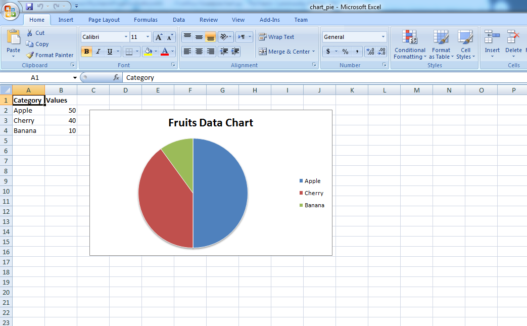
In this article i want to show you Plotting Pie Chart To Microsoft Excel with Python, we are going to use XlsxWriter library for this purpose. XlsxWriter is a Python module for writing files in the Excel 2007+ XLSX file format. XlsxWriter can be used to write text, numbers, formulas and hyperlinks to multiple worksheets and it supports features such as formatting and many more, including:
- 100% compatible Excel XLSX files.
- Full formatting.
- Merged cells.
- Defined names.
- Charts.
- Autofilters.
- Data validation and drop down lists.
- Conditional formatting.
- Worksheet PNG/JPEG/BMP/WMF/EMF images.
- Rich multi-format strings.
- Cell comments.
- Integration with Pandas.
- Textboxes.
- Support for adding Macros.
- Memory optimization mode for writing large files.
It supports Python 2.7, 3.4+ and PyPy and uses standard libraries only.
For plotting the charts on an excel sheet, firstly, create chart object of specific chart type( i.e Pie chart etc.). After creating chart objects, insert data in it and lastly, add that chart object in the sheet object. also for plotting the simple Pie chart on an excel sheet, use add_chart() method with type ‘pie’ keyword argument of a workbook object.
First of all you need to install the library
|
1 |
pip install XlsxWriter |
So now this is the complete code
|
1 2 3 4 5 6 7 8 9 10 11 12 13 14 15 16 17 18 19 20 21 22 23 24 25 26 27 28 29 30 31 32 33 34 35 36 37 38 39 40 41 42 43 44 45 46 47 48 49 50 51 52 53 54 55 56 57 58 59 60 61 62 63 64 |
# import xlsxwriter module import xlsxwriter # Workbook() takes one, non-optional, argument # which is the filename that we want to create. workbook = xlsxwriter.Workbook("chart_pie.xlsx") # The workbook object is then used to add new # worksheet via the add_worksheet() method. worksheet = workbook.add_worksheet() # here we create bold format object . bold = workbook.add_format({'bold':1}) # this is our data with data list headings = ['Category', 'Values'] data = [ ['Apple', 'Cherry', 'Banana'], [50, 40, 10], ] # Write a row of data starting from 'A1' # with bold format. worksheet.write_row('A1', headings, bold) # Write a column of data starting from # A2, B2, C2 respectively. worksheet.write_column('A2', data[0]) worksheet.write_column('B2', data[1]) #this is the type of chart chart1 = workbook.add_chart({'type': 'pie'}) # Add a data series to a chart chart1.add_series({ 'name':'Pie Sales Data', 'categories':['Sheet1', 1,0,3,0], 'values':['Sheet1', 1,1,3,1], }) #set the title for the chart chart1.set_title({'name':'Fruits Data Chart'}) #set the style for the chart chart1.set_style(10) #insert chart to the worksheet worksheet.insert_chart('C2', chart1, {'x_offset':25, 'y_offset':10}) #close the workbook workbook.close() |
Run the complete code and this will be the result

Also you can watch the complete video for this article
Subscribe and Get Free Video Courses & Articles in your Email
If we have data in multiple sheets.. Ex: Sheet 1 has a data and sheet 2 has another data in this case when we want append and plot the pie chart with % and original value like 80%, 80.. in their respective sheets. How can we achieve this?