In this Python Plotly tutorial we want to learn about Interactive Data Visualization with Python Plotly, So data visualization is a powerful tool for understanding and communicating insights from data. when it comes to Python we have different options for data visualization, and Plotly is one of them, Plotly is used for creating interactive and visually appealing charts and graphs. In this tutorial we want talk about some features of Plotly for data visualization.
Why Choose Plotly for Interactive Data Visualization ?
Plotly is an open-source library, and it provides different interactive chart types, including line charts, scatter plots, bar charts, pie charts, heatmaps and many more. These are a few reasons why Plotly is good for interactive data visualization:
- Interactivity: Plotly charts allows users to explore data dynamically. They can zoom in and out, pan across the chart, hover over data points for more information, toggle between different views and even select and filter data interactively.
- Customization: Plotly provides alot of customization options, and it allows you to cut your visualizations according to your specific needs. You can customize colors, fonts, labels, axes, tooltips and annotations to create nice and meaningful charts.
- Web-based Visualization: Plotly supports web-based visualization, it means that you can create interactive dashboards, embed charts in web applications, or share your visualizations online. This makes Plotly the best choice for creating interactive data visualizations for large audience.
So now to work with Plotly, first of all we need to install Plotly and we can use pip for that.
|
1 |
pip install plotly |
After that we can import Plotly module and any other required libraries for data manipulation or analysis:
|
1 |
import plotly.graph_objects as go |
Creating an Interactive Line Chart with Plotly
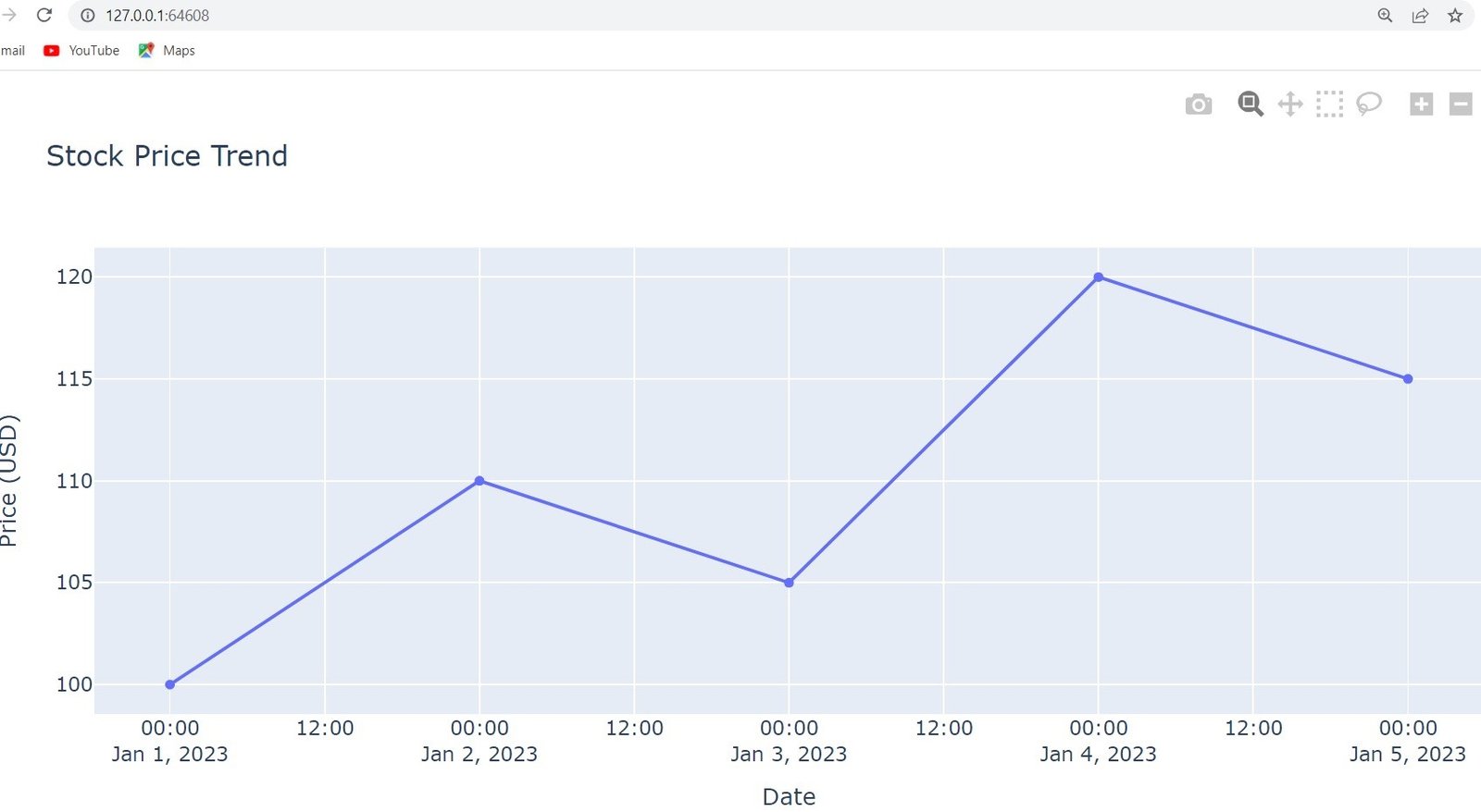
Now let’s create a practical example, suppose we have a dataset, and it contains daily stock prices for a specific company, and we want to visualize the price trend over time.
|
1 2 3 4 5 6 7 8 9 10 11 12 13 14 |
import plotly.graph_objects as go dates = ['2023-01-01', '2023-01-02', '2023-01-03', '2023-01-04', '2023-01-05'] prices = [100, 110, 105, 120, 115] fig = go.Figure(data=go.Scatter(x=dates, y=prices)) fig.update_layout( title='Stock Price Trend', xaxis_title='Date', yaxis_title='Price (USD)' ) fig.show() |
In the above example, we have used Scatter trace from Plotly graph_objects module to create a line chart. after that we have specified the x-axis values as dates and the y-axis values as the corresponding stock prices. By setting the title, xaxis_title, and yaxis_title attributes in the layout, we provide labels for the chart and axes. and lastly we call the show() method to display the interactive chart.
Run your code and this will be the output
More Articles on Python Plotly
- Python Plotly Tutorial
- Python Plotly for Scientific Visualization
- Python Plotly Geospatial Visualization
- Python Plotly vs Matplotlib
- How to Create Scatter Plot in Plotly
- How to Create 3D Plots in Python Plotly
- How to Create PieCharts in Python Plotly
- How to Create BarChart in Python Plotly
- Python Plotly Dashboards
Subscribe and Get Free Video Courses & Articles in your Email