In this Plotly tutorial we want to learn How to Create Scatter Plot in Plotly, so data visualization is an important part of data analysis and communication. and Python is a popular programming language, it offers different libraries for creating nice visualizations. and one of library is Plotly, it enables developers and data scientists to generate interactive and visually charts. In this article we want to talk about Plotly Scatter Plots.
First we need to install Plotly and we can use pip for that
|
1 |
pip install plotly |
How to Create Scatter Plot in Plotly ?
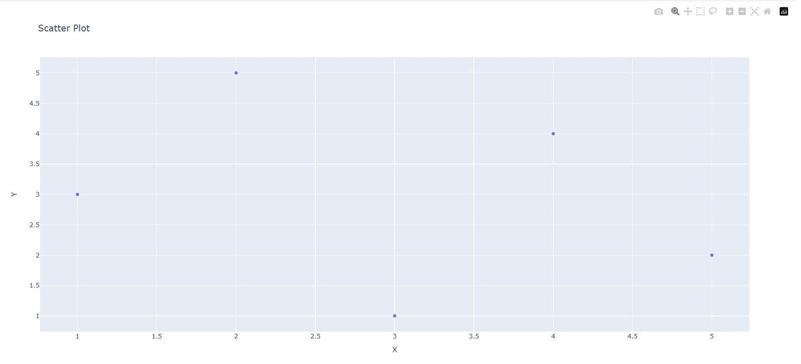
Now let’s start with a basic example of a scatter plot. Imagine we have a dataset with two numerical variables, X and Y. We want to visualize the relationship between these variables using a scatter plot. This is an example that you can start.
|
1 2 3 4 5 6 7 8 9 10 11 12 13 14 |
import plotly.graph_objects as go # Sample data x = [1, 2, 3, 4, 5] y = [3, 5, 1, 4, 2] # Create a scatter plot fig = go.Figure(data=go.Scatter(x=x, y=y, mode='markers')) # Set chart title and axis labels fig.update_layout(title='Scatter Plot', xaxis_title='X', yaxis_title='Y') # Show the chart fig.show() |
In the above code, we have defined the data we want to visualize, represented by the x and y lists. after that we have created go.Scatter object and pass the x and y parameters as the coordinates for the scatter plot. and lastly we set the chart title and axis labels using the update_layout method and display the chart using fig.show().
Run the code and this will be the result
Customizing Plotly Scatter Plots
Plotly allows you to customize different aspects of your scatter plots to better convey your data insights. These are a few examples:
- Marker Appearance: You can modify the appearance of markers in a scatter plot by setting attributes such as size, color, and symbol within the go.Scatter object. For example, marker=dict(size=8, color=’blue’, symbol=’circle’) will create blue circle markers with a size of 8.
- Adding Trendlines: To visualize the trend or regression line in a scatter plot, you can add a trendline by setting the trendline attribute within the go.Scatter object. This allows you to analyze the overall trend in the data.
- Bubble Charts: If you have a third numerical variable, you can create a bubble chart by assigning different marker sizes to represent the magnitude of that variable. By setting the size attribute within the go.Scatter object, you can create a bubble chart where the marker size corresponds to the variable’s value.
More Articles on Python Plotly
- Python Plotly Tutorial
- Python Plotly for Scientific Visualization
- Python Plotly Geospatial Visualization
- Python Plotly vs Matplotlib
Subscribe and Get Free Video Courses & Articles in your Email