In this Python Plotly article we want to learn about How to Create PieCharts in Python Plotly, data visualization is an important part of data analysis and communication. and Python is a popular programming language, it offers different libraries for creating nice visualizations. and one of library is Plotly, it enables developers and data scientists to generate interactive and visually charts. In this article we want to talk about Plotly pie charts.
Why to Use Plotly ?
Plotly is widely used library for data visualization, because it has the ability for creating dynamic and interactive charts. Also it offers different chart types, including scatter plots, line charts, bar charts, and pie charts. What sets Plotly apart is its ability to generate interactive visualizations that engage users, enabling them to explore data more effectively.
We need to install Plotly and we can use pip for that
|
1 |
pip install plotly |
How to Create PieCharts in Python Plotly
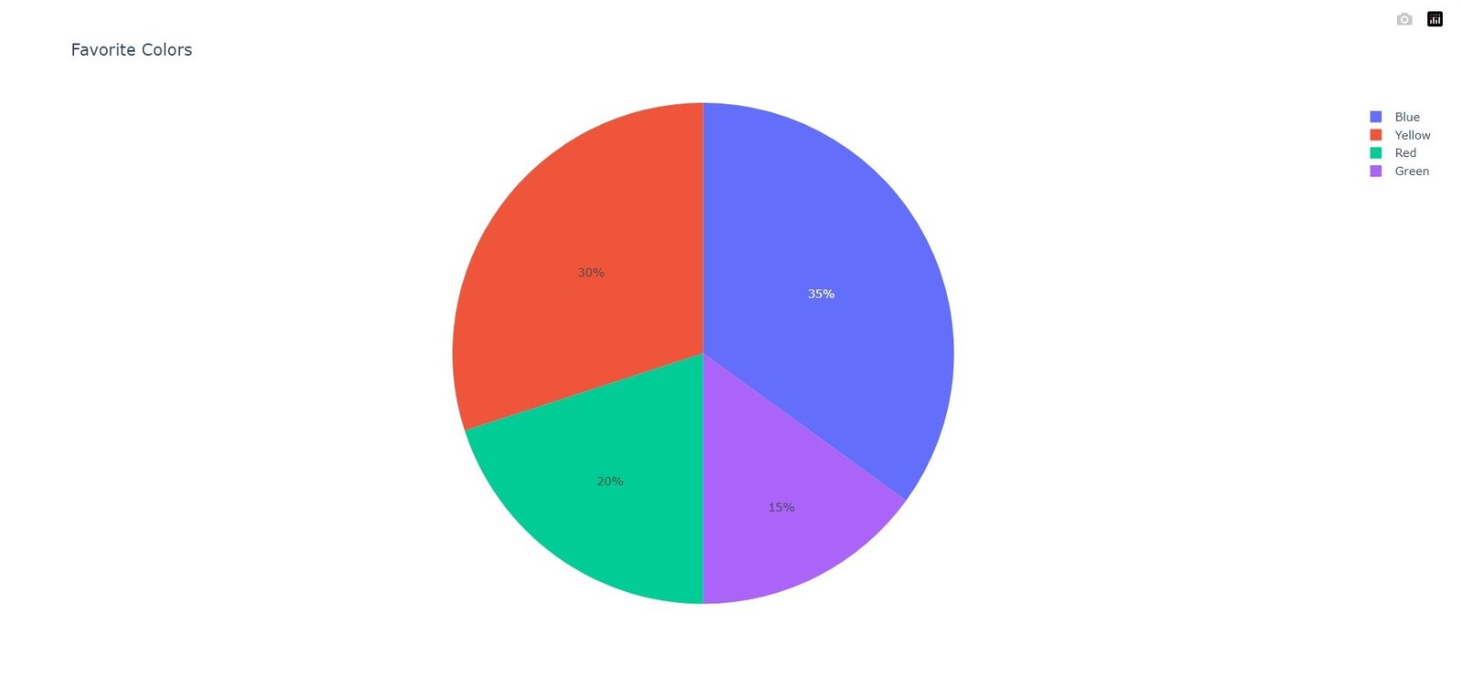
Let’s start with a basic example of pie chart. for example we have survey data representing the distribution of favorite colors among a group of individuals. We want to visualize this data using a pie chart. This is an example code to help you get started:
|
1 2 3 4 5 6 7 8 9 10 11 12 13 14 |
import plotly.graph_objects as go # Sample data colors = ['Red', 'Blue', 'Green', 'Yellow'] counts = [20, 35, 15, 30] # Create a pie chart fig = go.Figure(data=go.Pie(labels=colors, values=counts)) # Set chart title fig.update_layout(title='Favorite Colors') # Show the chart fig.show() |
In the above code, we have defined the data we want to visualize, represented by the colors list and counts list. after that we creates go.Pie object and pass the labels and values parameters as the data for the sectors of the pie chart. and lastly we set the chart title using the update_layout method and display the chart using fig.show().
This will be the output
Customizing Plotly Pie Charts
Plotly allows you to customize your pie charts in different ways to match your specific requirements. These are a few examples:
- Exploding Slices: You can highlight specific slices of the pie by exploding them. By setting the pull attribute inside the go.Pie object, you can create an exploded effect by specifying a list of values (e.g., [0, 0.2, 0, 0]) corresponding to each slice.
- Changing Colors: You can customize the colors of the pie chart by setting the marker attribute within the go.Pie object. For instance, marker=dict(colors=[‘#FF0000’, ‘#0000FF’, ‘#00FF00’, ‘#FFFF00’]) will assign individual colors to each sector.
- Donut Charts: To create a donut chart instead of a regular pie chart, you can set the hole attribute inside the go.Pie object. A value between 0 and 1 determines the size of the hole in the center of the chart.
More Articles on Python Plotly
- Python Plotly Tutorial
- Python Plotly for Scientific Visualization
- Python Plotly Geospatial Visualization
- Python Plotly vs Matplotlib
- How to Create Scatter Plot in Plotly
- How to Create 3D Plots in Python Plotly
Subscribe and Get Free Video Courses & Articles in your Email