In this tutorial we want to learn How to Create Cryptocurrency Candlestick Chart in Python, to create cryptocurrency candlestick chart in Python, we need to use different libraries, for example we are going to use Plotly or Matplotlib libraries along with yfinance. This is our step by step guide on how to create our candlestick charts using Plotly.
What is Plotly?
Plotly is an open source graphing library that enables you to creation interactive, high quality visualizations in Python, R, JavaScript, and other programming languages. It is particularly popular for its ability for generating dynamic, web based visualizations with minimal effort.
What is yfinance?
yfinance is a Python library that provides easy access to financial data from Yahoo Finance. Using this library data analysts can download historical market data such as stock prices, cryptocurrency prices, indices, and more.
Now let’s follow these steps for Creating Crypto Currency Candlestick Chart in Python.
Steps:
1: Install Required Libraries: You need plotly and yfinance to fetch the crypto data. You can install them using pip:
|
1 |
pip install plotly yfinance |
2: Fetch Cryptocurrency Data You can use yfinance to get cryptocurrency data like Bitcoin. If you already have your crypto data, you can load it into a pandas DataFrame.
3: Create the Candlestick Chart
Below is a sample code to create a candlestick chart using Plotly for Bitcoin cryptocurrency data:
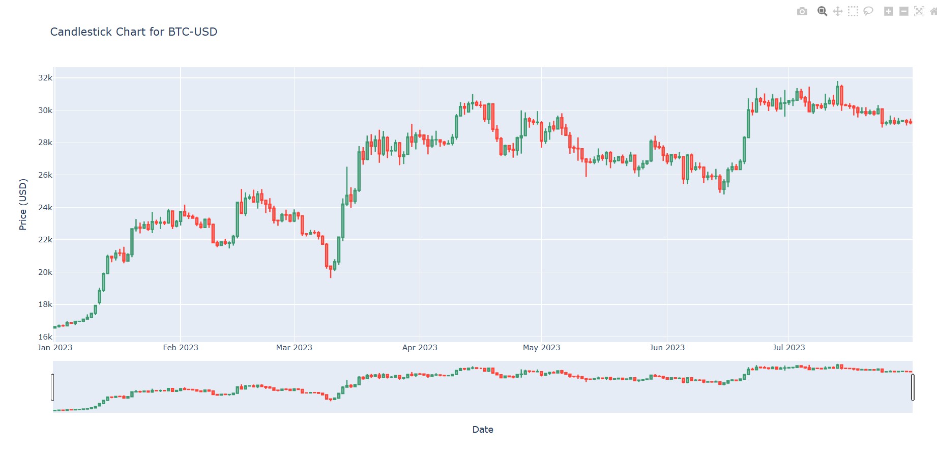
This is our complete code, running the below code produce an interactive candlestick chart of the selected cryptocurrency over the specific time range.
|
1 2 3 4 5 6 7 8 9 10 11 12 13 14 15 16 17 18 19 20 21 22 23 24 |
import yfinance as yf import plotly.graph_objects as go #Fetch Cryptocurrency Data crypto_symbol = 'BTC-USD' # Bitcoin in USD data = yf.download(crypto_symbol, start='2023-01-01', end='2023-08-01', interval='1d') # Prepare Data for Candlestick Chart candlestick_data = data[['Open', 'High', 'Low', 'Close']] # Create Candlestick Chart using Plotly fig = go.Figure(data=[go.Candlestick(x=candlestick_data.index, open=candlestick_data['Open'], high=candlestick_data['High'], low=candlestick_data['Low'], close=candlestick_data['Close'])]) # Add Titles and Labels fig.update_layout(title=f'Candlestick Chart for {crypto_symbol}', xaxis_title='Date', yaxis_title='Price (USD)') # Show the Chart fig.show() |
Run the code and this will be the result
Subscribe and Get Free Video Courses & Articles in your Email