In this Python Plotly tutorial we want to learn about How to Create BarChart in Python Plotly, so Plotly is one of the best library for data visualization because it has the ability of generating interactive charts with just a few lines of code. It offers different chart types, including scatter plots, line charts, pie charts, and of course, bar charts.
First of all we need to install Plotly and we can use pip for that.
|
1 |
pip install plotly |
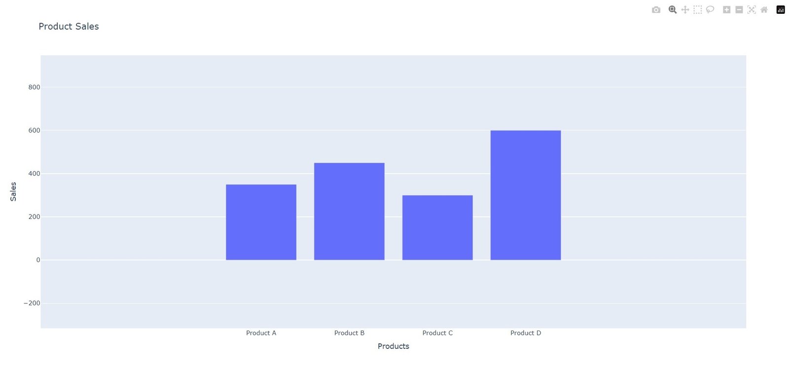
Let’s start with a basic example of a bar chart. Imagine we have data representing the sales figures for different products in a store. We want to visualize this data using a bar chart. Below is an example code to help you get started:
|
1 2 3 4 5 6 7 8 9 10 11 12 13 14 |
import plotly.graph_objects as go # Sample data products = ['Product A', 'Product B', 'Product C', 'Product D'] sales = [350, 450, 300, 600] # Create a bar chart fig = go.Figure(data=go.Bar(x=products, y=sales)) # Set chart title and axis labels fig.update_layout(title='Product Sales', xaxis_title='Products', yaxis_title='Sales') # Show the chart fig.show() |
In the above code, we have first defined the data we want to visualize, represented by the products list and sales list. after that we have created go.Bar object and pass the x and y parameters as the data for the x-axis and y-axis, and lastly we set the chart title and axis labels using the update_layout method and display the chart using fig.show().
Run the code and this will be the output

Customizing Plotly Bar Charts
Plotly allows you to customize your bar charts in different ways according to your specific requirements. These are a few examples:
- You can change the color of the bars by setting the marker attribute inside the go.Bar object. For example marker=dict(color=’blue’) will set all bars to blue. You can also use color scales or specify individual colors for each bar.
- Stacked Bar Charts: To create a stacked bar chart, where bars of different categories are stacked on top of each other, you can set the barmode parameter to ‘stack’ in the go.Layout object.
- Horizontal Bar Charts: By setting the orientation attribute to ‘h’ in the go.Bar object, you can create horizontal bar charts.
More Articles on Python Plotly
- Python Plotly Tutorial
- Python Plotly for Scientific Visualization
- Python Plotly Geospatial Visualization
- Python Plotly vs Matplotlib
- How to Create Scatter Plot in Plotly
- How to Create 3D Plots in Python Plotly
- How to Create PieCharts in Python Plotly
Subscribe and Get Free Video Courses & Articles in your Email