In this lesson i want to show you How to Build Charts with Python TKinter, so first of all let’s talk that what is TKinter ?
What is TKinter ?
Tkinter is standard GUI (Graphical User Interface) library for Python. It provides different tools for creating graphical user interfaces that are portable across multiple platforms, including Windows, macOS and Linux. Tkinter provides simple and easy way to create windows, dialogs, buttons, labels and other GUI elements using Python. with Tkinter, you can create different types of applications, from simple desktop applications to more complex ones, such as data visualization tools, games and multimedia players. Tkinter is included with most Python installations and is easy to learn and use, making it a popular choice for many Python developers.
How to Build Charts with Python TKinter ?
If you want to build charts with Tkinter, you can use Canvas widget to create custom chart visualizations. these are the steps you can follow:
- Import the Tkinter library: import tkinter as tk
- Create window using Tkinter’s Tk() method: root = tk.Tk()
- Create Canvas widget in the window usingCanvas() method: canvas = tk.Canvas(root, width=400, height=300)
- Draw shapes on the canvas to represent data. for example to draw bar chart you can create rectangles on the canvas using the create_rectangle() method.
- Position the shapes on the canvas using coordinates. You can use create_text() method to add labels to the chart.
- Pack the canvas into the window using pack() method: canvas.pack()
- Start the main event loop to display the window: root.mainloop()
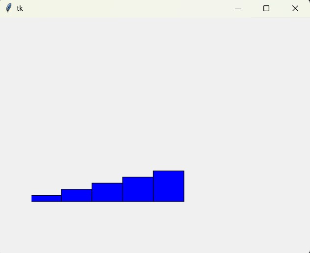
This is is an example that creates a bar chart with Tkinter:
|
1 2 3 4 5 6 7 8 9 10 11 12 13 14 15 16 17 18 19 20 21 22 23 24 25 26 27 28 29 30 31 |
import tkinter as tk # Importing the Tkinter module # Creating the root window root = tk.Tk() # Creating a canvas widget within the root window canvas = tk.Canvas(root, width=400, height=300) # Data representing the heights of bars in the bar chart data = [10, 20, 30, 40, 50] # Width of each bar bar_width = 50 # Initial horizontal offset for drawing bars x_offset = 0 # Looping through the data to create bars on the canvas for value in data: # Creating a rectangle (bar) on the canvas # The bars are drawn from the bottom up, so the # y-coordinate is calculated as 300 - value canvas.create_rectangle(x_offset, 300-value, x_offset+bar_width, 300, fill="blue") # Updating the x-coordinate offset for the next bar x_offset += bar_width # Packing the canvas widget within the root window canvas.pack() # Starting the Tkinter event loop root.mainloop() |
This example creates canvas with width of 400 and height of 300, and draws five blue rectangles on the canvas, with each rectangle representing a value from the data list.
Run the complete code and this will be the result.

FAQs:
Can you create charts in Python?
Yes, you can create charts in Python using different libraries. Some popular ones are Matplotlib, Seaborn, Plotly and Pandas. These libraries provides functions to create different type of charts such as line charts, bar charts, pie charts, scatter plots, and more.
Subscribe and Get Free Video Courses & Articles in your Email